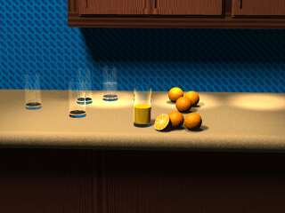
The year was 1995. The topic was the kitchen. So, I set out long ago to create a scene set in a kitchen. Orange Juice. The premise was simple, set out a few oranges, slice one in half, and have a few empty glasses, a glass of water, and a glass of juice. There's several problems with this scene:

|
| A rendering of the original scene file. I had to recreate the image maps, because they were missing. |
The image has a few problems, however:
In the image below, the coincident surface problem with the glass is illustrated. As you can see, random dots appear all over the bottom portion of the glass.
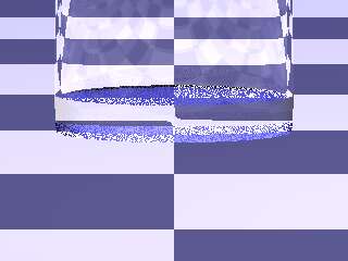
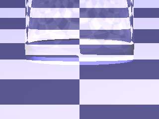
Originally I thought this was a CSG problem with the glass, but as it turns out it was actually because the glass was placed exactly on the counter top. The glass has been moved down by a distance of ε†.
Below, you can see the corrected glass placement:
As I began to try to reproduce the coincident surface error several things became apparent about the glass object: They were defined in a very strange manner and were difficult to translate to the proper place. Also—While we're on the subject of modifying the glass, we might as well redefine the glass to be a bit "nicer". Currently, they are simple cylinders, which is a bit dull. We need a nice shape for the glass. I used a good bit of CSG on the glass and made the base of the glass a bit nicer, and rounded off the top rim of the glass. The glass is still cylindrical, but it has a better look to it. Also, corrections were made to get the glass's base to sit at origin.
This is the definition for the new glass:
#macro CylindricalGlass2(r, th, h)

    // This will be differenced from the solid portion of the glass
    #local glass_negative = merge
    {
        cylinder { <0, 0.25*0.5, 0>, <0, h+epsilon, 0>, r - th }
        sphere { <0, 0.5, 0>, 0.5 scale <2*(r-th), 0.25, 2*(r-th)> }
        torus { r, 0.1 translate -0.2*y }
    }

    // This is the actual glass itself.
    #local glass_positive = merge
    {
        torus { r - 0.15, 0.15 }
        cylinder { <0, -0.15, 0>, <0, 0, 0>, r-0.15 }

        #local cos_t = vdot(vnormalize(<0.1, 0>), vnormalize());

        #local bot_r = abs(vrotate(0.1*x, z*degrees(acos(cos_t))).x -r);
        #local bot_t = vrotate(0.1*x, z*degrees(acos(cos_t))).y -0.2;

        // bottom modelling
        cylinder { <0, bot_t-epsilon, 0>, <0, -0.2, 0>, bot_r }
        cylinder { <0, -0.2+epsilon, 0>, <0, -0.2-0.05-epsilon, 0>, r-0.1-0.05}
        torus { r - 0.1 - 0.05, 0.05 translate y*(-0.2) }

        // top modelling
        cylinder { <0, 0, 0>, <0, h - th/2, 0>, r }
        torus { r-th/2, th/2 translate <0, h-th/2, 0> }

    }

    // Subtract the negative objects from the positive glass
    difference {
        object {glass_positive}
        object {glass_negative}
        translate y*(0.2+0.05)
    }

#end
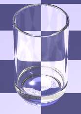
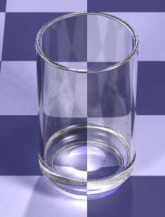
Currently, the glass's texture is using the old format and needs to be updated The glass texture will also need some tweaking to make it a bit more realistic, and hopefully a little less consuming to render. In creating the glass texture, I also want to make it a bit flexible. This will allow various colored glasses to be created. The color will be a filtering color, not a transmitting color.
|
| The new glass texture. Notice it has a shadow, now. In this render I used area lights to give a softer shadow |

|
| An array of colors is possible using the new texture |
†Epsilon (ε) is defined as 1.0x10⁻¹⁰ or 0.0000000001 in the case of POV-Ray.
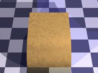
Currently, The texture for the counter top is a brownish-yellow with a bumps pattern. The counter top doesn't look quite right to me. Rather than try to fix this brownish, bumpy texture, I am going to define an entirely new texture for it.
|
| This is the old texture of the counter. Drab, dull, brown, and uninteresting |
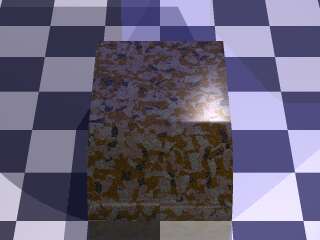
The next texture to work on is the orange. Again, rather than work on the texture itself, I'm going to completely redo the texture.
|
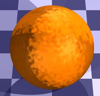
| This is the original texture for the orange. I think it would work well for a texture describing the surface of Jupiter's moon IO |
In creating the orange texture, one of the first things I did was define the coloring. It's a yellow-orange color, with some green-tinted spots to make it look convincingly like an orange (a real fruit will not be uniform in color, this helps with the illusion of non-uniformity).
From there, I applied reflection and specular to the orange's material. Usually fruit has a certain luster to it, this helps the effect. I then applied a normal of crackle with the standard form and some turbulence. This looked close to what I wanted but not quite. I then changed the wave form from the usual ramp wave to a scalloped wave. This gave the bumps a nice rounded look.
For the interior, I simply updated the image and bump maps and added a material map to give the rind area a flat look and the pulp area a bumpy, shiny look.
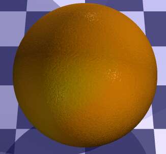
|
| The new texture for the orange. Now it looks like an orange! |
The trouble is, orange juice scatters light when it enters. We need to make it look like the light is being scattered around.
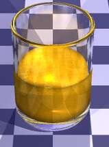
I added scattering media and photon interation to the new juice texture. It's not perfect, but it will do now. Due to the long render times, This was about as much as I could tweak the texture at the moment.
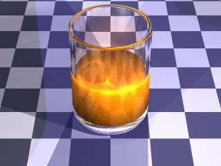
After rendering with the new orange juice texture using scattering media, a problem became apparent:
The results were this (notice the glass that had the orange juice in it):
Warning: Camera is inside a non-hollow object. Fog and participating media
may not work as expected.
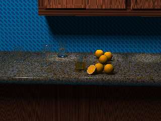
So, now I have to diagnose what was not hollow in the image ...
After looking at the scene, I had the back wall's plane inverted. But, there are other problems with the scene. The lighting is not right. The scattering media in the orange juice does not look right and is causing problems. Lighting of the scene will be one of the last items I will tackle in this article.
Moving along --
The wall, currently is a patterned texture (like sone sort of wallpaper) I'm going to change this to a nice tile backsplash. The tiles will be generally smooth, but with some irregularity.
This is the scene with the scattering media orange juice and tiles.
Before I get into creating new objects for the scene, The scene needs to be reorganised and set to a proper scale. Currently, the scene is a bit disorganised, and needs to have things put in their places. Objects have been scaled arbitrarily, which makes it difficult to determine what size objects should be. I have created a standard set of definitions to size the objects in "real-world" units
Since a majority of the scene has to be re-worked on scaling, this provides an opportunity to build a virtual world in which to house my scene. The following is a diagram of the kitchen's layout (remember, there are reflective objects, and they need an environment to reflect in order to look realistic. Not only that, but with global illumination turned on, the room needs to be filled out to a point to give a somewhat acurrate illumination. For instance, if the morning sunlight shines through the windows, that light needs to be diffused around the room.